Use and Misuse of Numerical Data

For a Section A report, use an appropriate title and introduction, then headings which follow the recipient's instructions. Put calculations in clear workings, interpret them in the report and reach concise conclusions. Do not leave copied requirements or mark allocations in the final response.
Do not confuse evaluating a performance report with evaluating the organisation's performance. Assess what the author included, omitted, classified or emphasised; whether the report addresses objectives and user needs; and how targets, benchmarks, definitions or narrative may create a misleading impression.
1 Narrative performance reporting
Narrative reporting explains performance in words. It should help the reader understand what happened, why it happened, whether it supports the organisation's purpose and what management will do next. It complements, rather than replaces, financial and non-financial measures.

1.1 Evaluating a performance report
A useful report should:
begin with the organisation's mission, strategy and the decisions the reader must make;
select a small number of relevant financial and non-financial measures;
compare actual performance with target, prior period and a suitable external benchmark;
distinguish significant movements from normal variation;
explain causes using evidence rather than assertion;
show links and trade-offs between measures, stakeholders, risk and time periods;
identify uncertainty, data limitations and matters outside management's control; and
state the action, accountable owner and expected timing.
A report may be accurate but still ineffective if it is too long, badly organised, untimely or written for the wrong audience. Different users require different detail. The board may need strategic exceptions and risks, while an operating manager may need frequent process-level information.
1.2 Information overload and presentation
More measures do not necessarily improve control. Too many indicators obscure priorities and may contain contradictory definitions. Dashboards should establish a clear hierarchy: headline outcome measures, the drivers of those outcomes and the exceptions requiring action.
Tables are useful where exact values matter. Charts are useful for trends, distributions and comparisons. The title, units, scale, time period, source and basis of calculation should be clear. Colour should not be the only means of communication, and the display should avoid unnecessary decoration.
2 Misleading narrative reporting
Narrative may mislead even when individual facts are technically correct. Warning signs include:
selective reporting – highlighting favourable measures while omitting adverse ones;
cherry-picked comparisons – choosing an unusually weak base year or unsuitable competitor;
percentage distortion – describing a large percentage change from a very small base without the absolute value;
vague language – words such as “strong”, “significant” or “on track” without criteria;
unjustified causation – claiming that one event caused another merely because they moved together;
passive or evasive language – concealing responsibility, for example “targets were not achieved”;
inconsistent definitions – changing a KPI, period or boundary without explanation;
misleading precision – presenting uncertain estimates as exact facts; and
omission of risk – reporting a current improvement without the cost or future consequence.
Professional scepticism requires the reader to compare the narrative with the underlying data, seek corroborating evidence and consider what has not been reported.
3 Preparing useful performance commentary
A concise structure is:
Outcome: state the material result and comparison.
Cause: explain the operational and external drivers, supported by evidence.
Consequence: link the result to strategy, stakeholders, risk and future performance.
Action: state the response, owner, timing and measure of success.
3.1 Illustration: weak commentary
“Performance was excellent. Revenue increased by 20% and the customer programme was successful. Management expects further strong growth.”
This commentary has no target or benchmark, no absolute amounts, no evidence that the customer programme caused the growth, and no discussion of profit, cash, customer retention, risk or uncertainty.
3.2 Improved commentary
“Revenue increased by 20% to $24 million, 8% above budget. Twelve percentage points arose from the acquisition completed in April; like-for-like revenue increased by 8%. Operating margin fell from 14% to 10%, mainly because expedited delivery and customer compensation increased by $1.1 million. On-time delivery was 82% against the 95% target and NPS fell from +38 to +21. The operations director will add weekend capacity and renegotiate the carrier SLA by 30 September. Weekly delivery performance and complaint recurrence will be reported to the executive team. The forecast assumes no further carrier disruption, so margin recovery remains uncertain.”
The improved version is balanced and quantified. It distinguishes acquired from underlying growth, connects financial and non-financial measures, identifies responsibility and action, and states an important assumption.
3.3 Reporting unusual or uncertain performance
Where data is incomplete or volatile, management should provide a range or scenario, explain the assumption and identify what evidence will cause the conclusion to change. It should not conceal uncertainty by choosing a single precise forecast.
Exam focus: tailor the report to the named recipient. Prioritise the scenario's most material matters, calculate useful comparisons, challenge misleading claims and write balanced conclusions with practical actions.Introduction
The APM syllabus contains the learning outcome:
‘Advise on the common mistakes and misconceptions in the use of numerical data used for performance measurement’.
The mistakes and misconceptions can be divided into two causes:
The quality of the data: what measures have been chosen and how have data been collected?
How have the data been processed and presented to allow valid conclusions to be drawn?
Inevitably, these two causes overlap because the nature of the data collected will influence both processing and presentation.
4 The collection and choice of data
4.1 What to measure?
What to measure is the first decision and the first place where wrong conclusions can be either innocently or deliberately generated. For example:
A company boasts about impressive revenue increases but downplays or ignores disappointing profits.
A manager wishing to promote one of two mutually exclusive projects might concentrate on its impressive IRR whilst glossing over which project has the higher NPV.
A production manager measures the quantity of units produced but not their quality.
An investment company with 20 different funds advertises only the five most successful ones.
Not only might inappropriate amounts be measured, but they might be deliberately undefined. For example, a marketing manager in a consumer products company might claim that the company’s new toothbrush is reported by users to be 20% better.
But what’s meant by that statement? What is ‘better’? Even if that quality could be defined, is the toothbrush 20% better than: using nothing, competitors’ products, the company’s previous products, or better than using a tree twig?
Another potential way to confuse readers is to report relative rather than absolute changes. For example, you will occasionally read reports claiming that eating a particular type of food will double your risk of getting a disease. Doubling sounds serious but what if you were told that consumption would change your risk from 1 in 10m to 1 in 5m? For most people doubling the risk does not look quite so serious now. The event is still rare and the risk remains very low.
Similarly, if you were told that using a new material would halve the number of units rejected by quality control, you might be tempted to switch to using it. But if the rate of rejections is falling from 1 in 10,000 to 1 in 20,000, the switch does not look so convincing – though it would depend on the consequences of failure.
4.2 Sampling
Many statistical results depend on sampling. The characteristics of a sample of the population are measured and, based on those measurements, conclusions are drawn about the characteristics of the population.
There are two potential problems:
For the conclusions to be valid, the sample must be representative of the population. This means that random sampling must to be used so that every member of the population has an equal chance of being selected for the sample. Other sorts of sampling are liable to introduce bias so that some elements of the population are over or under represented and false conclusions are likely to be drawn. For example, a marketing manager could sample customer satisfaction only at outlets known to be successful.
Complete certainty can only be obtained by looking at the whole population and there are dangers in relying on samples which are too small. It is possible to quantify these dangers and, in particular, you need to know information like “to a 95% confidence level, average salaries are $20,000 ± 2,300". This means that, based on the sample, you are 95% confident (the confidence level) that the population mean salary is between $17,700 and $22,300 (the confidence interval). Of course, there is a 5% chance that the true mean salary lies outside this range. Conclusions based on samples are meaningless if confidence intervals and confidence levels are not supplied.
The larger the sample the greater the reliance that can be placed on conclusions drawn. In general, the confidence interval is inversely proportional to the square size of the sample. So, to halve the confidence interval the sample size has to be increased four times – often a requiring a significant amount of work and expense.
4.3 More on small samples
Consider a company that has launched a new advert on television. The company knows that before the advert 50% of the population recognises its brand name. The marketing director is keen to show to the board that the ad has been effective in raising brand recognition to at least 60%. To support this contention a small survey has been quickly conducted by stopping 20 people at ‘random’ in the street and their brand recognition was tested. (Note that this methodology can introduce bias: which members of the population are out and about during the survey period? Which street was used? What are the views of people who refuse to be questioned?)
Even if the ad were completely ineffective and only 50% of the population recognises the brand it can be shown that there is a 25% chance that at least 12 out of the 20 selected will recognise the brand. So, if the director didn’t get a favourable answer in the first sample of 20, another small sample could be quickly organised. There is a good chance that by the time about four surveys have been carried out one of the results will show the improved recognition that the marketing director wants. (Note: these results make use of the binomial distribution, which you do not need to be able to use.)
It’s rather like flipping a coin 20 times – you intuitively know that there is a good chance of getting an 8:12 split in the results.
If instead of just 20 people being surveyed, 100 were asked, then the chance of getting a recognition rate of at least 60% would be only 1.8%.
In general, small samples:
Increase the chance that results are false positives.
Increase chance that important effects will be missed.
Always be suspicious of survey results that do not tell you how many items were in the sample.
Another example of a danger arising from small samples is that of seeing a pattern where there is none of any significance.
Imagine a small country of 100 km x 100 km. The population is evenly distributed and that four people will suffer from a specific disease. In the graphs below, the locations of the sufferers have been generated randomly using Excel and plotted on the 100 x 100 grid. These are actual results from six consecutive recalculations on the spreadsheet data and represent the six possible scenarios
Now imagine you are a researcher who believes that the disease might be caused high-speed trains. The dark diagonal line represents the railway track going through the country.
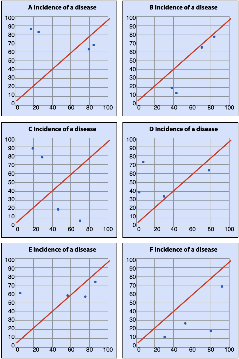
Have a look at the position of the dots (sick people) compared to the rail-tracks. If you wanted to see a clustering of disease close to the railway tracks you could probably do so in several of the charts. Yet the data has been generated randomly.
I didn’t have to do many more recalculations before the following pattern emerged:
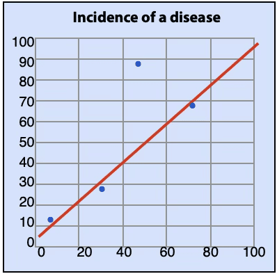
For people predisposed to believing what they want to believe, this graph is presenting them with a pattern they will interpret as conclusive evidence of the effect.
The problem is that if you are dealing with only four pieces of data then there is a good chance that they will often cluster around any given shape. The negative results such as seen in Graph C are easily dismissed and researchers concentrate on the patterns they want to see.
Now think about the following business propositions:
A business receives very few complaints about its level of service, but in one year all relate to one branch. Does that indicate that the branch is performing poorly or is it just an artefact of chance?
In a year a business tenders for 1000 contracts but only three are won – all by the same sales team. Does that really mean that that sales team is fantastic or is it again simply the result of chance?
5 The processing and presentation of data
5.1 Averages
Almost certainly when you use the term ‘average’ you are referring to the arithmetic mean. This is calculated by adding up all results and dividing by the number of results. So, for example:
Person | Height (cm) |
|---|---|
A | 175 |
B | 179 |
C | 185 |
D | 179 |
E | 176 |
Total | 894 |
So the arithmetic mean of these 5 people is 894/5 = 178.8 and this feels as though it is a natural way to describe an important measurement about the data. However, as we will see below, it can lead you astray.
The arithmetic mean is one measure of the data’s location. The other common measures are:
Mode: the most commonly occurring value. In the table above, the mode is 179. This measure would be more useful to you than the mean if you were a mobile phone manufacturer and needed to know customer preferences for phones of 8, 16, 32 or 64 GB. You need to know the most popular.
Median: this is the value of the middle ranking item. So, for the data above arrange it in ascending order of height and find the height of the person at the mid-point
Person | Height (cm) |
|---|---|
A | 175 |
E | 176 |
B | 179 |
D | 179 |
C | 185 |
So, the height of the mid-ranking person is 179 and this is the median
Unless the distribution of the data is completely symmetrical, the mean, mode and median will generally not have the same values. In particular, the arithmetic mean can be distorted by extreme values that give rise to its misinterpretation.
To demonstrate this we will initially set up a theoretical symmetrical distribution of the annual income of a population:
Number of people (000) | 10 | 20 | 30 | 40 | 50 | 40 | 30 | 20 | 10 |
Annual income $000 | 15 | 25 | 35 | 45 | 55 | 65 | 75 | 85 | 95 |
The mean, median and mode are all $55,000. If you earned that you would feel that you were on ‘average’ pay with as many people earning more than you as less than you.
Now let’s say that into this population comes the founder of a hi-tech internet company called Mark Gutenberg who invented a social medium service called U-Twit-Face. Mr Gutenberg has a very high income - $10m/year. The salary distribution now looks like:
Number of people | 10 | 20 | 30 | 40 | 50 | 40 | 30 | 20 | 10 | M Gutenberg | 1 |
Annual income $000 | 15 | 25 | 35 | 45 | 55 | 65 | 75 | 85 | 95 | 10000 |
The arithmetic mean of this distribution is $55,400, so now earning only $55,000 you feel that you are earning less than average. In fact over 50% of the population is earning less than ‘average’ – something that at first glance would seem impossible.
This distortion could allow a government to claim that people are now better off because average earnings are higher. In fact, even if all the salary bands were reduced by 5%, the arithmetic mean including Gutenberg would be around $55,380. So the government could claim that on average the population is better off when, in fact, almost everyone is worse off.
In situations where the data is not symmetrical, the median value will often provide a more useful measure. The inclusion of Gutenberg does not change the median value and if everyone’s income fell by 5%, so would the median.
5.2 False positives and false negatives: Bayes’ theorem
This will first be demonstrated using a medical example, then it will be applied to a more business-related area.
Assume there is a serious medical condition called ‘lurgy’ suffered by 5% of the population. There is a diagnostic test available, but this is not perfect. If the test result is positive there is a 90% chance that it is correct, and a 10% chance that it is wrong (false positive). If the test is negative, there is an 80% chance that the result is correct, but a 20% chance that the disease was missed (false negative).
You are tested and the result is positive, so what is the probability that you have lurgy? You might assume the answer is 90%, but that is far from the truth.
The easiest way to solve this is to construct a table, based (say) on 10,000 people.
Suffers from | Does not suffer | Total | |
|---|---|---|---|
Positive test result | |||
Negative test result | |||
Total | 500 | 9,500 | 10,000 |
First, put in the true number of the 10,000 who suffer from the disease: 5% and 95% of 10,000.
So, of the 500 who have the disease, the test will report correctly on 90% of them and incorrectly on 10%. In numbers this will be 90% x 500 = 450 who have the disease and who are correctly reported on, and 10% x 500 = 50 who have the disease but are not reported on.
Similarly, of the 9,500 non-sufferers, the test will correctly report on 80% of them. The numbers are 80% x 9,500 = 7,600. The remainder will be reported as having the disease, 20% x 9,500 = 1,900
The table can now be shown as:
Suffers from | Does not suffer | Total | |
|---|---|---|---|
Positive test result | 450 | 1,900 | 2,350 |
Negative test result | 50 | 7,600 | 7,650 |
Total | 500 | 9,500 | 10,000 |
So, you go to your doctor for your test results and find they are positive. You are obviously in the top line of this table (where the positive results are). From the population of 10,000 there are 2,350 positive results, but only 450 are true positives. Therefore your chance of actually having the disease is 450/2,350 = 19% - a far cry from the 90% you might have thought at the start.
Now let’s look at a business-orientated example.
Maxter Software Co creates software and web-sites for clients. They prefer to recruit employees with no programming experience and train them. It is believed that 1% of the population has the aptitude to become a programmer. The company asks each applicant to undergo an aptitude test. If someone has the proper aptitude the test will identify them correctly on 80% of occasions, but 20% are missed. If a recruit does not have aptitude there is a 5% chance that they will pass the test.
If someone is identified as having aptitude, what is the chance that they actually do?
Has aptitude | Does not have aptitude | Total | |
|---|---|---|---|
Passes test | 80 | 475 | 555 |
Does not pass test | 20 | 9,525 | 9,545 |
Total | 100 | 9,900 | 10,000 |
So the chance that a person who passes the test actually has aptitude is 80/555 = 14.4: not a great way to recruit successful staff.
5.3 Correlation
One of the commonest misuses of data is to assume that good correlation between two sets of data (ie they move closely together) implies causation (that one causes the other). This is an immensely seductive fallacy and one that needs to be constantly fought against.
For example, consider this data set:
Diabetes in UK1 (m) | Sales of smart phones in UK2 (m) | |
2012 | 3.04 | 26.4 |
2013 | 3.21 | 33.2 |
2014 | 3.33 | 36.4 |
2015 | 3.45 | 39.4 |
1 Diabetes UK | ||
On a graph the data looks like:
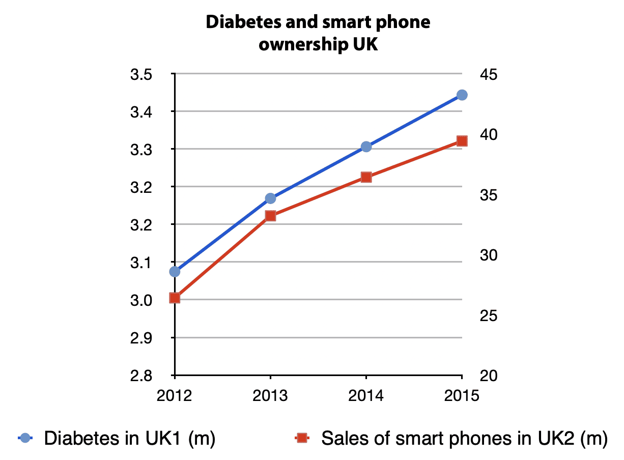
The two sets of data follow one another closely and indeed the coefficient of correlation between the variables is 0.99, meaning very close association.
It is unlikely that any of you believe that owning a smart phone causes diabetes or vice versa and you will easily prefer to believe that the high correlation is spurious. However, with other sets of data showing with high correlation it is easier to assume that there is causation. For example:
Use of MMR vaccines and incidence of autism. Almost no doctors now accept there is any causal connection. In addition the whole study was later discredited and the doctor responsible was struck off the UK medical register.
Cigarette smoking and lung cancer. A causal effect is well-established, but it took more than correlation to do so.
Concentration of CO2 in the atmosphere and average global temperatures. Not universally accepted (but increasingly accepted).
5.4 Graphs and pictograms
Here’s a graph of the £/€ exchange rate for September to October 2015. It seems to be quite a rollercoaster:
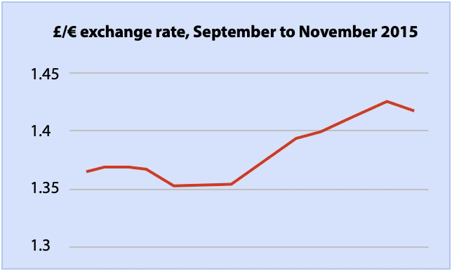
However, the effect has been magnified because the y axis starts at 1.3, not 0. The whole graph only stretches from 1.3 to 1.44. If the graph is redrawn starting the y axis at 0, then the graph will look a follows:
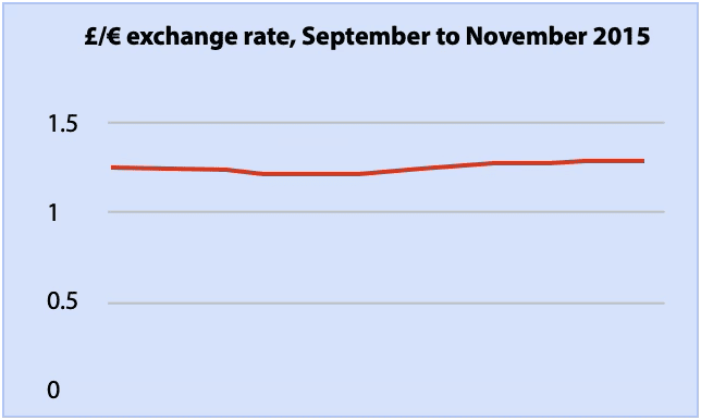
Not nearly so dramatic.
Note that a board of directors that wants to accentuate profit changes could easily make small increases look dramatic, simply by starting the y axis at a high value.
Pictograms are often used to make numerical results more striking and interesting. Look at the following set of results:
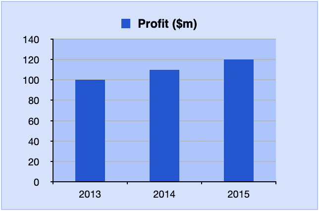
Year | Profit ($m) |
2013 | 100 |
2014 | 110 |
2015 | 120 |
The increase has been a relatively modest 10% per year and on a bar chart would appear as:
A pictogram could show this as
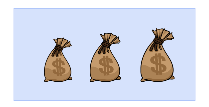
Look at the first and last bag of money and think about how much you could fit into each. I would suggest the capacity of the third one looks at least 50% greater than the first one. That’s because the linear dimensions have increased by 20%, but that means that the capacity has increased by 1.23 = 1.73, flattering the results.
6 Data visualisation
Data visualization is the representation of data using graphs, charts and diagrams. It uses images that:
Communicate relationships among a set or sets of data
Uncover relationships between data
Help users’ understanding of the data
Make an impact on users
Help users to remember the significance of data
Historically, data visualisation was limited to static charts and diagrams but increasingly data visualisations presented on computers allow users to explore the data sets eg by magnifying some areas of a graph, or the use of animated diagrams eg additional information can be displayed if the mouse pointer hovers over a figure.
7 Simple charts and diagrams
7.1 Pie charts
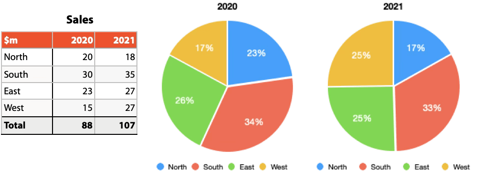
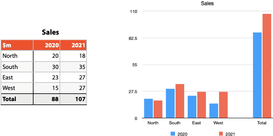
These are visually striking and are particularly good at showing the relative sizes of the components of a total. For example, it is easy to see how West’s importance has grown from 2020 to 2021 whereas North is less important. These diagrams are not so good at showing total growth or decline.
7.2 Bar charts
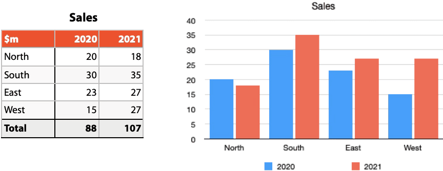
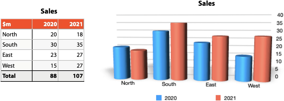
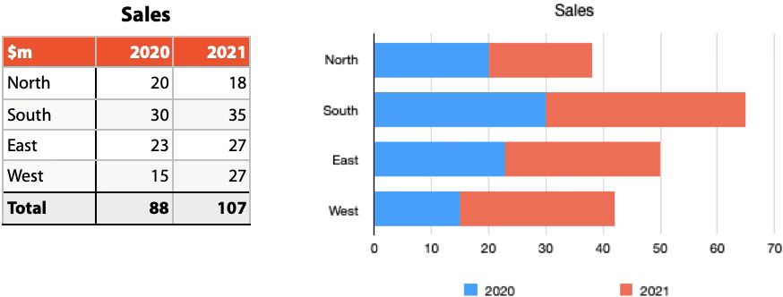
There is not real difference between the first and second diagrams, but Excel makes it easy to produce fancier charts, like 3D charts.
Once again, these two diagrams do not emphasise total sales growth, but they allow the relative performance of each area from one year to the next to be easily seen.
If total sales were to be shown also, it is easy to add another set of columns:
7.3 More complex charts and diagrams
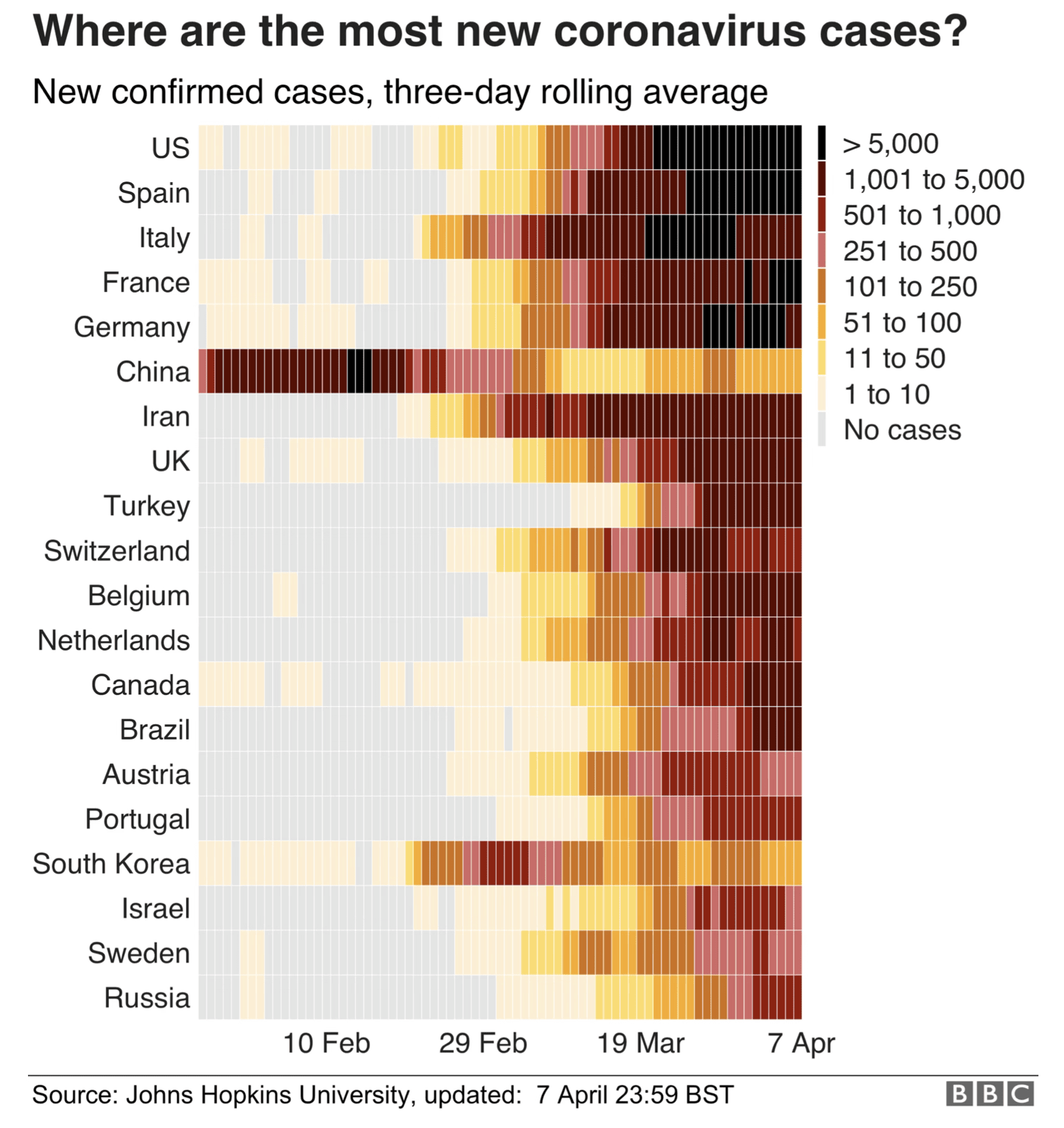
More complicated sets of data might require more ingenious charts and diagrams to display the information well. You would not have to invent a diagram as complex as shown in the following examples. They are here just for illustration.
Covid–19 virus effect over time in many different countries
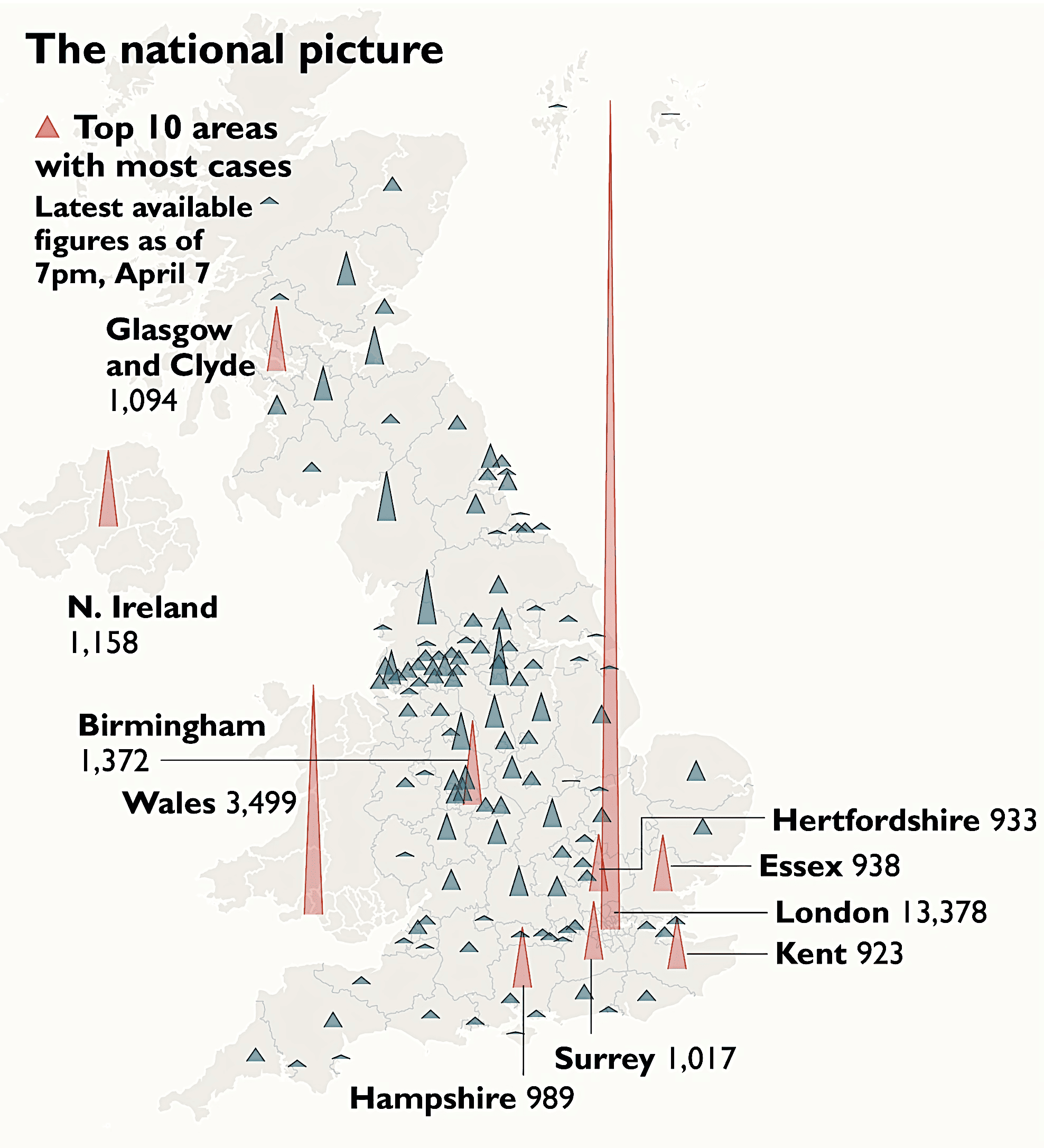
The second example, below, is also drawn from a presentation of the Covid-19 epidemic in the UK. Note that this type of visualisation could just could just as easily be effectively used to present sales of a new product in different town and regions.
7.4 Box and whisker plot
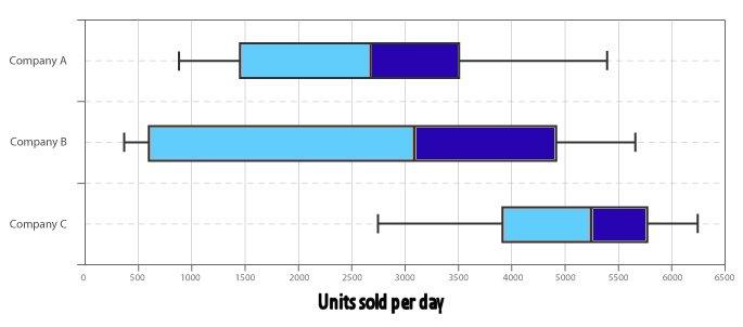
This diagram shows simple information about how values are distributed.
The extreme left of each bar are the lowest values for each company and the extreme right the highest values.
Moving from the left, the box starts at the lower quartile value (ie the value that separates the lowest 25% and the highest 75% of values). The light-coloured box shows the third quartile values ie 25% - 50% of all values. The dark coloured box is the second quartile values (50% to 75% of all values and the ‘whisker’ to the right shows the top 25% of values. The median is where the light and dark boxes meet and the median value is the value half-way down the population when it is arranges in descending order.
We can see that Company C units sold are generally higher than the other companies. Also, Company B shows a very wide dispersion (spread) of daily unit sales.
7.5 Time series
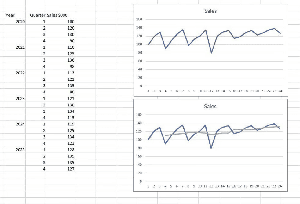
A time series simply shows how a value moves as time passes. For example, sales per quarter year.
The first graph shows a plot of the raw data and this goes up and sown fairly regularly with the seasons. If you want to see the trend (ie the underlying increase or decrease over time) then there are ways in which the data can be smoothed out (eg by using moving averages). The second diagram shows a trend line superimposed on the raw data plot.
7.6 Time series and growth
Growth can be defined in two ways:
An absolute increase each period
A percentage increase for each period over the pervious period. This represents exponential growth (like compound interest) and can quickly lead to very large changes in the absolute amounts.
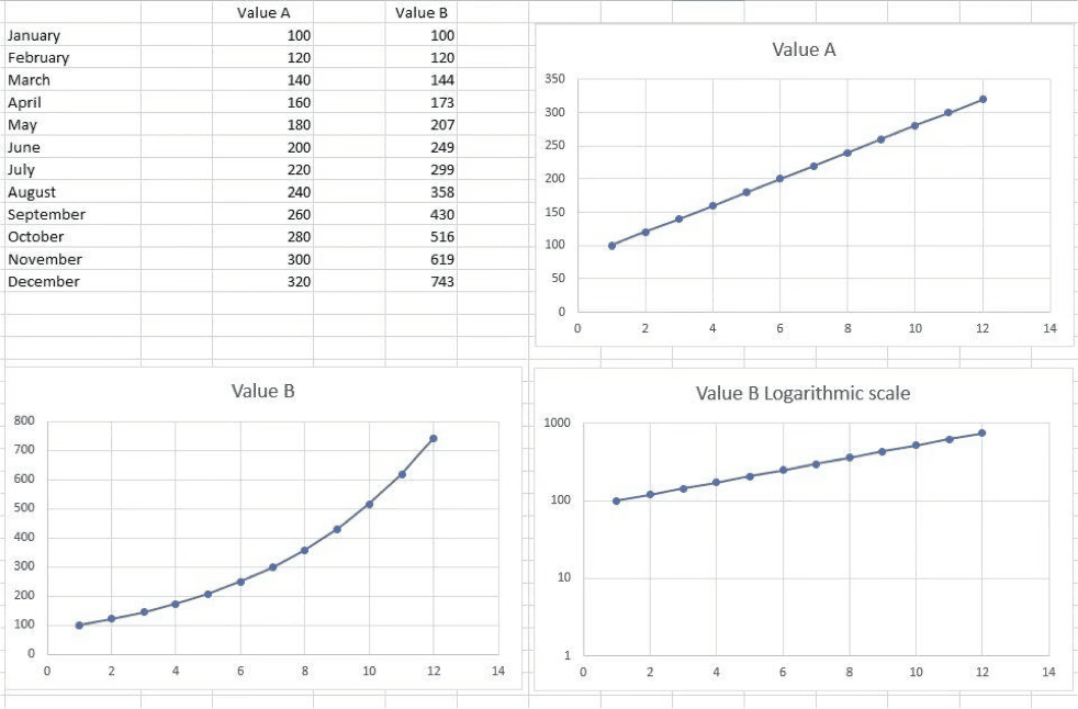
The diagram below shows the two types of growth in a table. Value A is increasing by a constant 20 per month. Value B is increasing at a constant 20% per month. You will see how rapidly Value B pulls ahead of Value A.
When Value A is plotted, it is a simple straight line showing a constant absolute increase per period, here 20 per month. The steeper the line, the greater the absolute growth per month.
If Value B is plotted then there is a ‘ski-jump’ pattern as the absolute increases get larger and larger because of the compounding effect. There is no easy way to tell by looking at the curve if the increase is a constant 20% or if it has begun to fall to say 18% or 15%.
To see if the % rate of growth is changing or is constant, the plot has to be made using a logarithmic scale. Note that on that graph the vertical axis divisions go 10, 100, 1000 is each division represents a multiple of 10. Not the constant exponential growth is represented by a straight line. Any change from 20% per month would show that line getting steeper or flatter.
Logarithmic scales are also very useful for accommodating data that cover a very wide range on the same graph.