
Data and information

1 Data and information
Syllabus
This chapter serves BA1 C1(a) — the difference between data and information, and the characteristics of good information — and C1(b), identifying relevant data from graphs, charts and diagrams. C1(b) names four things in particular: SCATTER DIAGRAMS, HISTOGRAMS, BAR CHARTS AND OGIVES. All four are drawn in this chapter, each next to the data it is drawn from.
The most common definition of information is:
Definition
Information = data with meaning.
DATA is raw facts and figures. On its own it is usually not very useful. A list of every outstanding invoice in value order tells a credit controller almost nothing. Sort the same figures by customer, and then within each customer by the age of the invoice, and it has become INFORMATION: the user can interpret it and act on it.
Nothing was added. The same numbers were arranged so that a question could be answered from them, and that is the whole of the difference between the two words.
A second example makes the point in a different way. “Sales were $1,000,000 this year” is data. Split the same figure by region — $400,000 in Europe, $300,000 in Asia and $300,000 in the Americas — and it starts to be information, because now it can be compared with last year, with the budget, or with the cost of serving each region. Split it again by product and it answers more questions still.
Presenting data as graphs and charts does the same job, and section 3 is about that.
The lecture for this chapter is nearly three times the length of the written chapter and is worth playing in full. One thing to know:
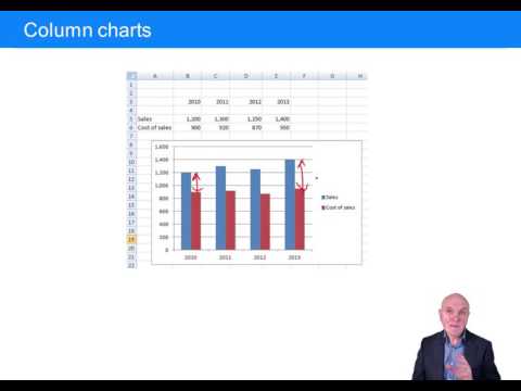
The four charts it discusses — a column chart, a line chart, a scattergraph and a pie chart — are each drawn in this chapter, next to the data they are drawn from.
2 The characteristics of good information
The characteristics of good information can be remembered with the mnemonic ACCURATE.
ACCURATE. High-quality information should be accurate — which does not necessarily mean accurate to the last cent. It means accurate enough for the purpose it is being used for. A board of directors may be perfectly happy with figures rounded to the nearest thousand, or even the nearest million dollars.
COMPLETE. It should include everything that needs to be included for a proper decision to be made. A cost that has been left out will not be noticed, and the decision will be wrong.
COST-BENEFICIAL. There is no point in obtaining information at a huge cost if the benefit derived from it, financial or otherwise, is small. We are not in the business of information for its own sake: information should either help make more profit or help run the organisation more efficiently.
USER-TARGETED. It should be presented in a way that is useful to the particular user. Senior managers usually want summaries; accounts staff need far more detail.
RELEVANT. Do not supply people with more information than they need, or with information they can do nothing about. They may be confused by it, or may overlook the important part inside it.
AUTHORITATIVE. The source should be one that can be relied on. Anyone who has used a search engine knows the problem: some of what comes back is from authoritative sources, some from amateurs and some from charlatans.
TIMELY. Information should arrive quickly enough to make a better decision possible. Some has to arrive within seconds, or within fractions of a second in an industrial process. For other purposes a week or two is fine. Faster information is usually more expensive information, which is why this characteristic and cost-beneficial have to be read together.
EASY TO USE. It should be well presented and well documented. Often that means a graph rather than a table — which is what the rest of this chapter is about.
3 Presenting data
Displaying data on graphs and charts has three advantages.
The data is turned into information, because a picture often conveys meaning better. You see the lines and the bars and immediately grasp how the figures are changing.
It makes more of an impact and is more memorable. A graph of profit dipping into a loss says more than a string of figures turning negative.
Relationships are uncovered. If a chart shows revenue and costs and the two lines are converging, it is obvious that costs are catching up with revenue.
Throughout this section the same four years of data are used, so that you can see what each chart type does with the same figures.
$000 | 20X1 | 20X2 | 20X3 | 20X4 |
Sales | 400 | 460 | 540 | 620 |
Cost of sales | 300 | 330 | 370 | 410 |
Gross profit | 100 | 130 | 170 | 210 |
3.1 Bar charts and column charts
A COLUMN CHART shows each figure as a vertical bar. A BAR CHART is the same chart with the bars running horizontally. Both are named in the syllabus, and both are read the same way.
It is immediately obvious that the gap between the two bars is growing over the four years. Sales have increased substantially and the rise in costs is much smaller, so gross profit is widening — from $100,000 to $210,000. That conclusion is in the table as well, but you have to work for it there and not here.
3.2 Line charts
A LINE CHART shows the same information but joins the points up, which makes it better for showing a movement over time and worse for comparing individual values. The divergence between the two lines is the same finding as the widening gap between the two bars.
The years are numbered 1 to 4 on the horizontal axis, standing for 20X1 to 20X4.
3.3 Scatter diagrams
A SCATTER DIAGRAM — or scattergraph — plots one variable against another to show how the two move together. It can be used with time on one axis, but it is more often used for two non-time variables: sales against advertising spend, cost against production volume, or domestic fuel consumption against outside temperature.
A household’s electricity consumption was recorded for ten months, together with the average outside temperature in each of them.
Average temperature (°C) | Electricity used (kWh) |
2 | 13,000 |
5 | 12,000 |
8 | 10,500 |
11 | 9,000 |
14 | 7,500 |
17 | 6,000 |
20 | 4,800 |
23 | 3,500 |
26 | 2,200 |
29 | 1,000 |
Set out as a table, the readings say very little. Plotted as a scatter diagram, with a trend line drawn through the points to emphasise the relationship, it says a great deal:
Electricity consumption falls as the temperature rises, and the points lie close enough to the trend line that the relationship looks strong. Chapter 8 shows how to fit that line arithmetically instead of by eye, and how to measure how strong the relationship really is.
3.4 Pie charts
A PIE CHART shows the proportions of the elements that make up a whole, as slices of a circle. It is good at one thing — showing that this part is about a quarter and that part is about a half — and bad at everything else, because the eye compares angles badly and two similar slices cannot be told apart.
Market segment | Revenue ($000) | Share of total |
Europe | 620 | 41% |
Asia | 450 | 30% |
North America | 310 | 21% |
South America | 120 | 8% |
Total | 1,500 | 100% |
Drawn as a pie, South America is instantly visible as the smallest segment and Europe as the largest. Notice what the chart cannot tell you: whether South America is growing, and whether $120,000 is a lot. A pie chart shows a split at one moment and nothing else.
4 Frequency distributions and histograms
A FREQUENCY DISTRIBUTION shows how many times a given quantity, or group of quantities, occurs in a set of data.
4.1 Discrete and continuous data
There are 100 apartments in a block, and the number of people living in each was counted:
Number of inhabitants | 1 | 2 | 3 | 4 | 5 | 6 | Total |
Frequency (apartments) | 14 | 22 | 30 | 25 | 8 | 1 | 100 |
This is a DISCRETE frequency distribution, because the number of inhabitants can only take particular values: 1, 2, 3. You cannot have 3.54 inhabitants.
CONTINUOUS distributions allow any value, so the values have to be grouped into classes to be of any use. There are 294 inhabitants in the block altogether — (14 × 1) + (22 × 2) + (30 × 3) + (25 × 4) + (8 × 5) + (1 × 6) = 14 + 44 + 90 + 100 + 40 + 6 = 294 — and if we measured their heights we might get this:
Height range | Frequency |
0.8 – <1.0 m | 10 |
1.0 – <1.2 m | 22 |
1.2 – <1.4 m | 45 |
1.4 – <1.6 m | 69 |
1.6 – <1.8 m | 73 |
1.8 – <2.0 m | 67 |
2.0 – <2.2 m | 8 |
Total | 294 |
Frequency distributions are commonly shown on two types of chart: HISTOGRAMS, which are frequency-density charts, and OGIVES, which are “less than” charts.
4.2 Histograms
A histogram looks very like a column chart, but there are no gaps between the columns, because the classes are adjacent ranges of a continuous variable rather than separate categories.
4.3 Unequal class widths
The rule
In a histogram it is the AREA of each column that represents the frequency, not its height.
Where every class is the same width — as above, where every range is 0.2 m — height is proportional to area, so you can plot the frequency directly and nothing goes wrong. Where the classes are NOT all the same width, plotting the frequency as the height would make the wide class look far more common than it is.
Suppose the two classes covering 1.6 m to 2.0 m had been combined into one:
Height range | Width | Frequency | Frequency ÷ standard width | Height plotted |
0.8 – <1.0 m | 0.2 m | 10 | 10 ÷ 1 | 10 |
1.0 – <1.2 m | 0.2 m | 22 | 22 ÷ 1 | 22 |
1.2 – <1.4 m | 0.2 m | 45 | 45 ÷ 1 | 45 |
1.4 – <1.6 m | 0.2 m | 69 | 69 ÷ 1 | 69 |
1.6 – <2.0 m | 0.4 m | 140 | 140 ÷ 2 | 70 |
2.0 – <2.2 m | 0.2 m | 8 | 8 ÷ 1 | 8 |
Total | 294 |
The combined class is 0.4 m wide, which is TWICE the standard width of 0.2 m. Its column is therefore drawn twice as wide and half as high: the height plotted is 140 ÷ 2 = 70, not 140. The area is still 140, which is what the eye is reading. (The chart below plots the reduced height, 70, and marks the double-width class “(×2)”; drawn by hand, that column would also be twice as wide.)
The class widths here are in METRES — 0.2 m and 0.4 m. Whatever the unit, what matters is the RATIO: a class twice as wide is drawn half as high.
5 Cumulative frequency and the ogive
An OGIVE, or less-than curve, plots CUMULATIVE frequencies. Take the original height table, add a column that accumulates the frequency as you go down, and change the range column to the UPPER END of each interval — because a cumulative figure answers the question “how many are less than this?”
Height range | Frequency | Cumulative frequency | Upper end of range |
0.8 – <1.0 m | 10 | 10 | 1.0 |
1.0 – <1.2 m | 22 | 32 | 1.2 |
1.2 – <1.4 m | 45 | 77 | 1.4 |
1.4 – <1.6 m | 69 | 146 | 1.6 |
1.6 – <1.8 m | 73 | 219 | 1.8 |
1.8 – <2.0 m | 67 | 286 | 2.0 |
2.0 – <2.2 m | 8 | 294 | 2.2 |
So the table says, for example, that 146 people are less than 1.6 m tall. Plotting the cumulative frequency on the vertical axis against the upper end of each range on the horizontal axis gives the ogive:
Ogives usually have this characteristic stretched-S or “swan neck” shape.
5.1 Reading the median and the quartiles
An ogive is drawn in order to be READ, and what it is read for is the median and the quartiles. The method is always the same: work out the cumulative frequency you are looking for, find it on the vertical axis, go across to the curve, and drop down to the horizontal axis.
Measure | Cumulative frequency wanted | Read off the ogive |
Lower quartile (Q1) — a quarter are below it | 25% × 294 = 73.5 | About 1.39 m |
Median — half are below it, half above | 50% × 294 = 147 | About 1.60 m |
Upper quartile (Q3) — three quarters are below it | 75% × 294 = 220.5 | About 1.80 m |
The MEDIAN is the value that splits the population in half: 50% are taller and 50% are shorter. The QUARTILES split it at a quarter and at three quarters — that is, the 25%/75% and the 75%/25% points. The distance between the two quartiles is called the interquartile range, and it is a simple measure of how spread out the population is: here it is 1.80 − 1.39 = 0.41 m, so the middle half of these inhabitants are between about 1.39 m and 1.80 m tall.
The quartiles are the 25%/75% and 75%/25% splits. If you see them described as a 25%/70% split somewhere, that is a typing error — the two proportions have to add to 100%.
6 Tests
The chapter’s own five questions follow. Work each one before you open the answer.
Which of the following should be more meaningful to users?
A Data
B Information
Show answerHide answer
Good information can be described by the mnemonic ‘ACCURATE’. What do the letters stand for?
Show answerHide answer
Name two charts used to display frequency distributions.
Show answerHide answer
Say whether each of the following is discrete or continuous data.
Discrete | Continuous | |
Number of children under 10 in each family | ||
Weight of individuals in a population | ||
Distance between cities | ||
Family income rounded to the nearest $000 |
Show answerHide answer
Draw the following data on a cumulative frequency curve.
Family income ($) | Frequency |
0 – <2,000 | 5 |
2,000 – <3,000 | 20 |
3,000 – <5,000 | 500 |
5,000 – <10,000 | 100 |
10,000 – <20,000 | 10 |
Show answerHide answer
7 Test your knowledge
Two quick checks before you move on: work through the flashcards to fix this chapter’s key terms and definitions, then sit the objective questions for exam-style practice. Both mark themselves and explain the answers as you go.
Data and information
12 questionsAnswer the questions one at a time. Your progress is saved so you can leave and come back.
Open chapter practice